Organising a successful event requires more than booking a venue and inviting attendees. Whether you’re hosting a business conference, product launch, fundraising event, workshop, seminar, trade show, or community gathering, the way you present your event plays a major role in attracting participants and leaving a lasting impression.
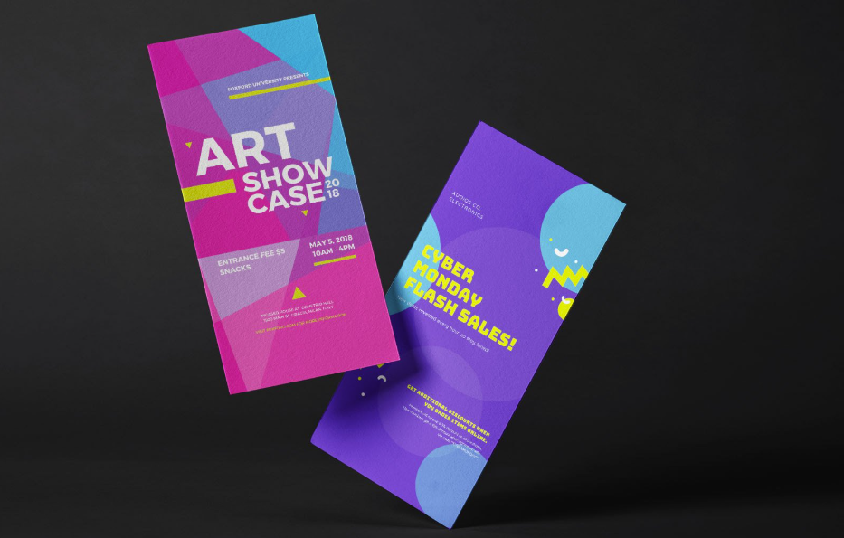
Two of the most effective marketing assets for any event are a professionally designed flyer and an engaging presentation. A well-crafted flyer helps generate interest before the event, while a compelling presentation keeps attendees engaged and reinforces your message during the event.
This comprehensive guide explains how to create both effectively, even if you have little or no design experience.
Why Professional Event Materials Matter
First impressions are important. In many cases, your flyer is the first thing potential attendees see. If it looks unprofessional or lacks important information, people may lose interest before learning what your event has to offer.
Similarly, a poorly designed presentation can distract your audience and reduce the impact of your message. Professional event materials demonstrate credibility, improve communication, and create a memorable experience.
Benefits of professional event materials include:
- Increasing event registrations
- Building trust with your audience
- Creating a consistent brand image
- Improving audience engagement
- Communicating information clearly
- Making your event appear organised and credible
See also: Installing an Indoor Sauna: Electrical, Foundation, and Clearances
Understand Your Event Objectives
Before opening any design software, define exactly what you want to achieve.
Ask yourself the following questions:
- What is the purpose of the event?
- Who is the target audience?
- What action should attendees take?
- What message should they remember?
- What tone best represents the event?
Your answers will guide every design decision, from colours and fonts to the wording and layout.
Know Your Audience
Different audiences respond to different design styles.
For example:
| Audience | Recommended Style |
|---|---|
| Business professionals | Clean, modern, minimal |
| Students | Bright and energetic |
| Charity supporters | Friendly and emotional |
| Corporate clients | Elegant and professional |
| Local community | Simple and welcoming |
Designing specifically for your audience improves engagement and encourages participation.
Create an Effective Flyer
A flyer is designed to communicate essential information quickly. Most people spend only a few seconds scanning promotional material, so clarity is essential.
When creating your flyer, make sure it includes:
- Event title
- Date
- Time
- Venue
- Short event description
- Speaker or organiser information
- Registration details
- Website or QR code
- Contact information
Avoid including unnecessary details that make the design feel cluttered.
Write a Strong Headline
Your headline should immediately capture attention.
Examples include:
- Join Our Annual Business Summit
- Learn New Digital Marketing Strategies
- Build Better Leadership Skills
- Discover the Future of Technology
Keep headlines concise, relevant, and easy to understand.
Choose the Right Colours
Colours influence how people perceive your event.
Some common colour associations include:
- Blue – Trust and professionalism
- Green – Growth and sustainability
- Red – Energy and excitement
- Orange – Creativity
- Black – Luxury and sophistication
Use colours consistently throughout both your flyer and presentation.
Select Readable Fonts
Typography significantly affects readability.
Best practices include:
- Limit yourself to two or three fonts.
- Use larger fonts for headings.
- Maintain high contrast between text and background.
- Avoid decorative fonts for body text.
Simple fonts improve accessibility and professionalism.
Use High-Quality Images
Visuals attract attention far faster than text.
Choose images that:
- Are high resolution
- Match your event theme
- Support your message
- Are legally licensed
- Reflect your audience
Poor-quality images can make even an excellent event appear unprofessional.
Maintain Consistent Branding
Your promotional materials should look like they belong together.
Use consistent:
- Logo placement
- Colour palette
- Font styles
- Icons
- Graphic elements
- Photography style
Strong branding helps attendees recognise your organisation across different platforms.
Build a Powerful Presentation
After attracting attendees with your flyer, your presentation becomes the centrepiece of the event.
An effective presentation tells a story instead of simply displaying information.
A recommended presentation structure includes:
- Welcome slide
- Introduction
- Agenda
- Main content
- Supporting visuals
- Key takeaways
- Call to action
- Questions and answers
Each section should naturally flow into the next.
Keep Slides Clean
One of the biggest presentation mistakes is placing too much text on each slide.
Instead:
- Use bullet points.
- Include icons.
- Add relevant images.
- Highlight key statistics.
- Break complex ideas into multiple slides.
Your audience should focus on your explanation rather than reading paragraphs of text.
Make Data Easy to Understand
If your presentation contains statistics or research, present them visually.
Useful visual elements include:
- Pie charts
- Bar charts
- Timelines
- Infographics
- Comparison tables
Visual storytelling makes complex information easier to remember.
Include Interactive Elements
Audience interaction improves engagement.
Ideas include:
- Live polls
- Q&A sessions
- Short quizzes
- Audience discussions
- Demonstrations
- Case studies
Interactive presentations help maintain attention throughout the event.
Optimise for Different Viewing Formats
Your event materials may appear in several places:
- Social media
- Email newsletters
- Printed handouts
- Digital displays
- Projectors
- Mobile devices
Test your designs on multiple screen sizes to ensure everything remains readable.
Proofread Before Publishing
Small mistakes can reduce credibility.
Before distributing your flyer or presentation, check for:
- Grammar mistakes
- Spelling errors
- Incorrect dates
- Wrong contact information
- Broken website links
- Inconsistent formatting
Having another person review your materials can help identify errors you may have overlooked.
Common Mistakes to Avoid
Many event organisers unintentionally reduce the effectiveness of their promotional materials.
Avoid these common mistakes:
- Using too many colours
- Overcrowding the design
- Choosing unreadable fonts
- Adding excessive animations
- Using low-resolution images
- Ignoring branding consistency
- Forgetting a clear call to action
Simple, organised designs usually perform better than overly complicated ones.
Helpful Design Tips
For more professional-looking event materials:
- Leave sufficient white space.
- Align text consistently.
- Use visual hierarchy.
- Keep paragraphs short.
- Prioritise important information.
- Use icons where appropriate.
- Keep branding consistent.
- Focus on readability over decoration.
These small improvements can dramatically increase the effectiveness of your designs.
Conclusion
Creating a professional flyer and presentation doesn’t require expensive software or years of design experience. By understanding your audience, using consistent branding, organising information clearly, and focusing on readability, you can produce promotional materials that attract attention and deliver your message effectively.
Whether you’re planning a corporate conference, educational seminar, product launch, or community event, investing time in high-quality event materials helps create a positive first impression and improves audience engagement. With careful planning and thoughtful design, your flyer and presentation can become valuable tools for making your next event a success.
Frequently Asked Questions
What makes a flyer effective?
An effective flyer clearly communicates the event details, uses an attractive design, includes a strong headline, and provides a clear call to action.
How many slides should an event presentation include?
There is no fixed number. Focus on presenting your information clearly without overwhelming the audience.
What is the ideal font size for presentations?
Headings should generally be large enough to read from the back of the room, while body text should remain clear and legible on all devices.
Should a flyer match the presentation design?
Yes. Consistent colours, fonts, logos, and graphics create a professional appearance and strengthen brand recognition.
Can I create professional event materials without design experience?
Yes. Many modern design platforms provide templates and drag-and-drop tools that allow beginners to create polished flyers and presentations with ease.
Why is branding important for event materials?
Consistent branding builds trust, improves recognition, and creates a cohesive experience across all promotional materials.